In this demonstration we will use Keras and TensorFlow 2.3 to explore data, normalize data, and build both a linear model and Deep Neural Network (DNN) to solve a regression problem. TensorFlow Core 2.3 includes tf.keras, which provides the high level (high abstraction) Keras Application Programming Interface (API) for TensorFlow. Keras simplifies the command and control of TensorFlow. The TensorFlow ecosystem also contains straightforward and simple vehicles for normalization and other common Machine Learning data preparation constructs.
The following bulleted list captures the steps we will execute in this demonstration:
- Explore the data set
- Normalize the training data
- Build, Compile, Train and Evaluate a Linear Model
- Build, Compile, Train and Evaluate a DNN
Next month, we will address the issue of over-fitting by using Principal Component Analysis (PCA) to reduce the dimensionality of the data set. In that blog post we will:
- Drop features (via PCA) to address over-fitting
- Revisit the Linear Model
- Revisit the DNN
- Compare, discuss and contextualize the results
1. Explore the data set
This demo revisits the BUPA Liver Disorders data set, a classic, tough data set that I have explored in three prior blog posts:
- Applying a Reduced Columb Energy (RCE) Neural Network to the Bupa Liver Disorders Data Set
- A Graphical introduction to Probabalistic Neural Networks (PNN)
- Refactoring Matlab Code to R Tidyverse
The dataset includes five biological features, a record of drinks per day and an arbitrary selector variable that the original data compilers used for their initial models.
- mcv: mean corpuscular volume
- Four Chemical Markers
- alkphos: alkaline phosphotase
- sgpt: alamine aminotransferase
- sgot: aspartate aminotransferase
- gammagt: gamma-glutamyl transpeptidase
- drinks: # of half-pint equivalents of alcohol per day
- selector: field used to split data into two sets
MCV and the four chemical markers provide the features for the model. The model's label vector records drinks per day. We throw out the obsolete selector feature.
Our regression problem seeks to predict the number of alcohol servings a person drinks per day (label) based on the recorded biological stats (features).
Import the Data
I prefer to use requests over the low level urllib3 to pull the data from Irvine. Once I retrieve the content I stuff the data into a Pandas DataFrame and immediately drop the selector column into the bitbucket.
# Import the data
import pandas as pd
import numpy as np
import io
import requests
url = 'https://archive.ics.uci.edu/ml/machine-learning-databases/liver-disorders/bupa.data'
r = requests.get(url).content
column_names = ['mcv',
                'alkphos',
                'sgpt',
                'sgot',
                'gammagt',
                'drinks',
                'selector']
bupa_df = pd.read_csv(io.StringIO(r.decode('utf-8')),
                      names = column_names).astype(np.float32)
bupa_df.drop('selector',
             axis=1,
             inplace= True)
bupa_df.head()
The DataFrame's head method outputs the first few lines of the frame.
| id | mcv | alkphos | sgpt | sgot | gammagt | drinks |
|---|---|---|---|---|---|---|
| 0 | 85 | 92 | 45 | 27 | 31 | 0 |
| 1 | 85 | 64 | 59 | 32 | 23 | 0 |
| 2 | 86 | 54 | 33 | 16 | 54 | 0 |
| 3 | 91 | 78 | 34 | 24 | 36 | 0 |
| 4 | 87 | 70 | 12 | 28 | 10 | 0 |
Check for Correlation
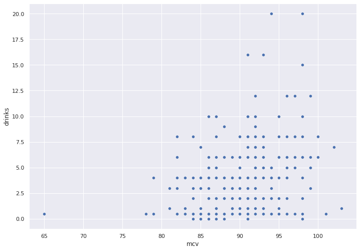
We pick a feature at random, mcv and use a simple scatter plot to check for any obvious correlation between this feature and our target variable, drinks.
import seaborn as sns
sns.set( rc = { 'figure.figsize' : (11.7, 8.27)})
sns.scatterplot(x = bupa_df['mcv'],
                y = bupa_df['drinks'])
No obvious correlation jumps out in the scatter plot below.
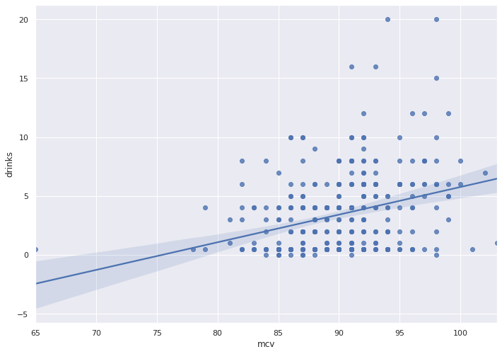
To be sure, we will use Seaborn to plot the best fit trend line and error bands.
sns.regplot(x = bupa_df['mcv'],
            y = bupa_df['drinks'])
The graph depicts fat error bands and a near-horizontal trend line, which reflects little to no correlation.
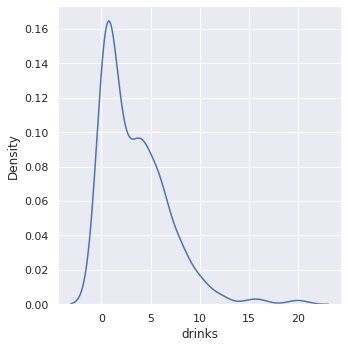
We plot a Kernel Density Estimation (KDE) of the drinks variable. KDE plots estimate the density of a continuous random variable, in this case, drinks. Imagine a smooth histogram, or a histogram with really skinny bars.
sns.displot( x = bupa_df['drinks'],
             kind = 'kde' )
From the density plot we see that most people drink less than a couple of drinks per day.
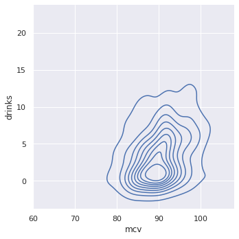
A continuous bivariate joint density function captures the probability distribution of two random variables. Imagine a top down view of the density plot above, with the density plot for MCV mixed in.
sns.displot(x = bupa_df['mcv'],
            y = bupa_df['drinks'],
            kind = "kde")
The near-circular shape shows the dearth of correlation between MCV and Drinks.
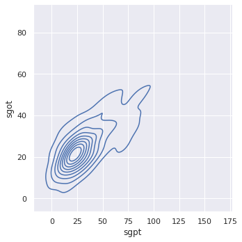
To contrast, observe two features with excellent correlation, SGPT and SGOT. We will leverage this correlation when we apply dimensionality reduction to our data set.
sns.displot(x = bupa_df['sgpt'],
            y = bupa_df['sgot'],
            kind = "kde")
Notice the sharp, nearly 45 degree angle of the bi-variate density plot, which indicates strong correlation.
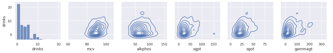
We plot the correlation between drinks and all features. If one feature presents strong correlation then we can simply use that feature, throw out the rest and then take a nap.
x_vars = ['drinks',
          'mcv',
          'alkphos',
          'sgpt',
          'sgot',
          'gammagt']
y_vars = ["drinks"]
g = sns.PairGrid(bupa_df,
                 x_vars = x_vars,
                 y_vars = y_vars)
g.map_offdiag(sns.kdeplot)
g.map_diag(sns.histplot)
g.add_legend()
None of the features show strong (or any) correlation with drinks, so we will need to proceed with Machine Learning approaches for our prediction model.
Split the Data
We split the data into three buckets:
- Train - To train a model
- Validate - To tune the model
- Holdout (aka Test) - To test the model
The holdout data set surprises the model with completely unknown data, which helps predict expected real-world performance. I use the term test in the code below. The train/ test split partitions rows into different buckets. The features/ label split pops off the label column into a separate vector. TensorFlow uses a DataFrame for the features matrix and a series for the label vector.
NOTE: We will further split the train dataset into train and validate sets when we train the model.
train_dataset = bupa_df.sample(frac=0.8,
                               random_state = 0)
test_dataset = bupa_df.drop(train_dataset.index) # Remove the rows that correspond to the train DF

train_features = train_dataset.copy()
test_features = test_dataset.copy()

train_labels = train_features.pop('drinks') #The pop removes drinks from the fetures DF
test_labels = test_features.pop('drinks')
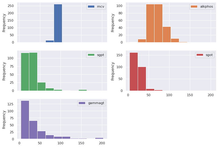
Take a quick look at the summary statistics for the train dataset.
train_dataset.describe().transpose()[['mean','std']]
| feature | mean | std |
|---|---|---|
| mcv | 90.2 | 4.4 |
| alkphos | 70.0 | 18.3 |
| sgpt | 30.6 | 20.1 |
| sgot | 24.4 | 10.2 |
| gammagt | 38.0 | 37.5 |
| drinks | 3.4 | 3.4 |
Notice that for drinks, our target (label), μ = σ = 3.4.
We already looked at the density plot for drinks. We now plot the histograms of the features.
train_features.plot.hist(subplots=True,
                         layout = (3,2))
Notice that each feature encompasses a different range of values. To comply with Machine Learning best practices, we will normalize the data.
2. Normalize the data
We normalize the data between -1 and 1. Most blogs describe the manual normalization process. TensorFlow 2.X, however, provides an experimental normalization engine.
Import the required packages.
import tensorflow as tf
from tensorflow import keras
from tensorflow.keras import layers
from tensorflow.keras.layers.experimental import preprocessing
Create a normalizer object.
normalizer = preprocessing.Normalization()
Feed the normalizer engine our data, so the engine gets a feel for the ranges and statistical summaries.
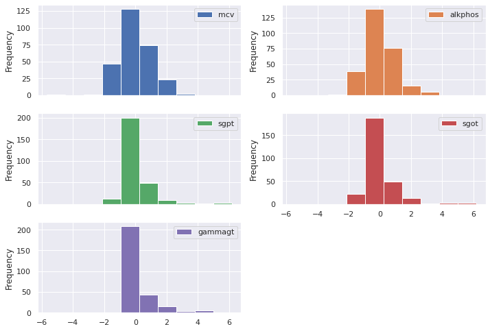
normalizer.adapt(np.array(train_features))
The normalizer inputs a data set, and the numpy() method returns a matrix of normalized numbers. We pass this numpy matrix to a Pandas DataFrame and then plot the new, normalized histogram.
(pd
   .DataFrame(normalizer(train_features)
   .numpy(), columns = ['mcv', 'alkphos', 'sgpt', 'sgot', 'gammagt'], index = train_features.index)
   .plot
   .hist(subplots=True, layout = (3,2)))
Much better! The normalized data cluster around zero.
3. Create a Linear Model
Keras makes life easy. The following line of code creates a linear regression model.
linear_model = keras.Sequential([normalizer, layers.Dense(units=1)])
Every Machine Learning course in history seems to fixate on Gradient Descent for the first few weeks. In this case, we do not use Gradient Descent to optimize our model, instead we use ADAM. In addition, I set the loss function to Mean Square Error (MSE). In practice, you should use Mean Absolute Error (MAE), however, I use MSE in order to drive some interesting thought experiments in the final interpretations section of next month's blog post.
linear_model.compile(optimizer=tf.optimizers.Adam(learning_rate=0.1),
                     loss='mean_squared_error')
Run through one hundred epochs to train the model. We use 1/5 of the train data to validate the model. I use an NVIDIA Tesla K80, which keeps the clock time to under 3 seconds. A CPU will take about 30 seconds.
%%time
history = linear_model.fit(
    train_features, train_labels,
    epochs=100,
    verbose=0, #turn off loggs
    validation_split = 0.2 #validation on 20% of the training
)
CPU times: user 3.85 s, sys: 312 ms, total: 4.16 s
Wall time: 2.83 s
Keras plops the training information into a table. The following function plots the table for us to look at.
import matplotlib.pyplot as plt
def plot_loss(history):
  plt.plot(history.history['loss'],
           label='loss')
  plt.plot(history.history['val_loss'],
           label='val_loss')
  plt.ylim([0, 12])
  plt.xlabel('Epoch')
  plt.ylabel('Error [Drinks]')
  plt.legend()
  plt.grid(True)
Now plot the training history.
plot_loss(history)
Our loss on the train data set (blue line) lands at around nine (MSE), or a root mean square error (RMSE) of 3. This means that, for the average person, the model predicts either three too many or three too few drinks per day. We discuss the impacts of this RMSE in the final interpretations section of next month's blog post.
The validation set, however, fares better, with an MSE of under eight, and an RMSE of ~2.8.
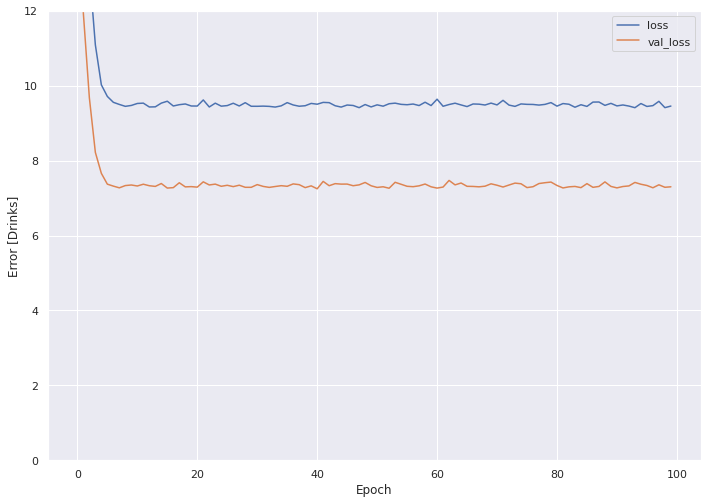
Good loss on train and validate sets do not mean much. Data Scientists can overfit a model to their train data, which does not generalize well in the wild.
The proof of the pudding lies in the taste therein... only the error of the holdout (test) set matters.
test_results = {}
test_results['Linear Model'] = (linear_model.evaluate(test_features, test_labels))**0.5
print(test_results)
3/3 [==============================] - 0s 1ms/step - loss: 10.3520
{'Linear Model': 3.217451704088136}
On the holdout set, the liner model produces an RMSE of ~3.2
4. Train a Dense Neural Network (DNN)
Keras lets us assemble a Dense Neural Network (DNN) model layer by layer. The following function will use Keras to build and compile our DNN model.
def build_and_compile_model(norm):
  model = keras.Sequential([
      norm,
      layers.Dense(64, activation='relu'),
      layers.Dense(64, activation='relu'),
      layers.Dense(1)
  ])

  model.compile(loss='mean_squared_error',
                optimizer=tf.keras.optimizers.Adam(0.001))

  return model
We pass the model a normalizer (created above) to normalize the data before it hits the DNN.
dnn_model = build_and_compile_model(normalizer)
Keras prints the model summary to the screen. The model includes four layers, a normalization layer that accepts a five feature data set, two 64 feature dense layers, and then the single parameter output layer, which provides the prediction for number of drinks per day.
dnn_model.summary()
Model: "sequential_12"
_________________________________________________________________
Layer (type)                 Output Shape              Param #
=================================================================
normalization_1 (Normalizati (None, 5)                 11
_________________________________________________________________
dense_20 (Dense)             (None, 64)                384
_________________________________________________________________
dense_21 (Dense)             (None, 64)                4160
_________________________________________________________________
dense_22 (Dense)             (None, 1)                 65
=================================================================
Total params: 4,620
Trainable params: 4,609
Non-trainable params: 11
_________________________________________________________________
Train the DNN and record the loss for the train and validate (set to 1/5) data sets.
%%time
history = dnn_model.fit(
    train_features, train_labels,
    validation_split=0.2,
    verbose=0,
    epochs = 100)
CPU times: user 4.01 s, sys: 468 ms, total: 4.48 s
Wall time: 3.09 s
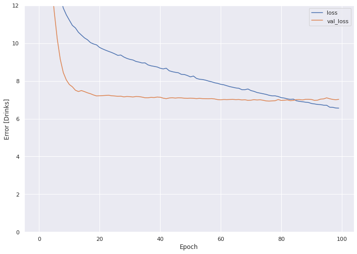
Plot the loss.
plot_loss(history)
The train loss slopes down and the validation loss holds constant.
The evaluate method checks the holdout (test) set.
test_results['DNN'] = (dnn_model.evaluate(test_features, test_labels))**0.5
print(test_results)
3/3 [==============================] - 0s 1ms/step - loss: 10.9154
{'Linear Model': 3.217451704088136, 'DNN': 3.3038437219287813}
The DNN model shows RMSE of 3.3, worse than the Linear Model.
Conclusion
In this demonstration we first used the requests package to pull a dataset directly off the UC Irvine website and stuff the data into a Pandas data frame. We explored the data using a combination of traditional analytics, Seaborn, Matplotlib and fundamentals of statistics. We then used the experimental TensorFlow normalizer to normalize our data set. We also used TensorFlow to create our Train, Validate and Holdout data sets. Keras provided a vehicle to create both a linear model and a Dense Neural Network (DNN).
The added complexity of the DNN produced a reduction in performance over the linear model. Worse performance due to added complexity points to over-fitting. We will address the issue of DNN over-fitting next month by using Principal Component Analysis (PCA) to reduce the dimensionality of the data set. We will use PCA to drop features.