In Pattern Classification Using Neural Networks (IEEE Communications Magazine, Nov. 1989) Richard P. Lippman provides the following definition of Exemplar neural net classifiers:
[Exemplar classifiers] perform classification based on the identity of the training examples, or exemplars, that are nearest to the input. Exemplar nodes compute the weighted Euclidean distance between inputs and node centroids
The nearest neighbor classifier represents the most popular and widely used exemplar neural net classifier in the domain of Machine Learning (ML). Every ML framework and platform provides a library to execute nearest neighbor classification.
In this blog post, I will develop Python code to implement a lesser known exemplar classifier, Reduced Columb Energy (RCE).
The RCE algorithm assigns a class to test data based on whether or not the data points live inside hit footprints of training data.
Open my post A Graphical Introduction to Probabalistic Neural Networks in a new tab for a deep dive into the math behind RCE.
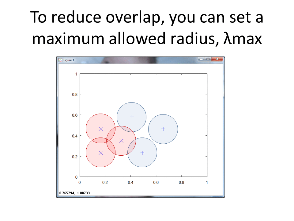
At a high level, RCE draws a circle around each labeled training observation, with a radius (lambda) equal to the distance of the closest labeled training point in the opposite class. Each circle indicates the hit footprint for that class.
RCE vs. Nearest Neighbor (NN)
The following two-dimensional (2d) plot shows five data points, two of class X, two of class O and one unknown observation, ?, we wish to classify.
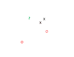
The NN algorithm uses the classes of the nearest data points to classify an unknown observation. Based on the plot above, NN identifies that the green question mark belongs to class X. The two X's clearly lie closer to the green question mark than the two red O's.
RCE, however uses a hit radius approach to classify datum. The algorithm calculates a footprint for each of the known data, with radii lengths determined by the vicinity of data from the opposite class. The RCE footprint for the four data points follows:

Based on this model, the green question mark lands in the footprint of the red class, and RCE indicates that the unknown observation belongs to class O.
Explore the Data
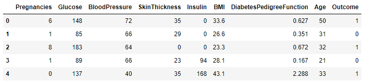
I use the Pima Indians Diabetes dataset to craft my model. The dataset includes observations of eight features and a two-class label. The labels indicate the presence or absence of diabetes.
First, import the data into a Pandas DataFrame.
import pandas as pd
import numpy as np

pima_df = pd.read_csv('diabetes.csv')
pima_df.head()
The head() method gives a quick peek at the features and observations.
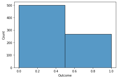
A quick Seaborn histogram depicts the frequency of Outcome Zero (No Diabetes) vs. Outcome One (Diabetes).
import seaborn as sns
sns.histplot( pima_df['Outcome'],
              bins=2)
A quick glance shows that 2/3 of the observations indicate no diabetes.
Explore One Feature
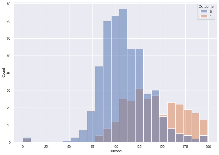
Of all the given features, I assume that Glucose will impact Outcome the most, so I update the histogram to depict the relationship between the two.
sns.set( rc = {'figure.figsize' : (11.7, 8.27)})
sns.histplot( x = pima_df['Glucose'],
              hue = pima_df['Outcome'])
Blood sugar over 150 appears to indicate diabetes. Lower than 150 we see a lot of overlap.
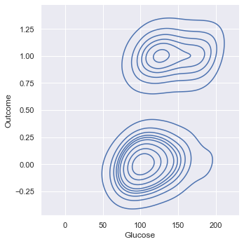
Kernel Density Estimation (KDE) provides a smoothed "overhead view" of the histogram.
sns.displot( x = pima_df['Glucose'],
             y = pima_df['Outcome'],
             kind = 'kde')
This view also shows the lack of clear separation between the two Outcomes based on Glucose.
Explore Two Features
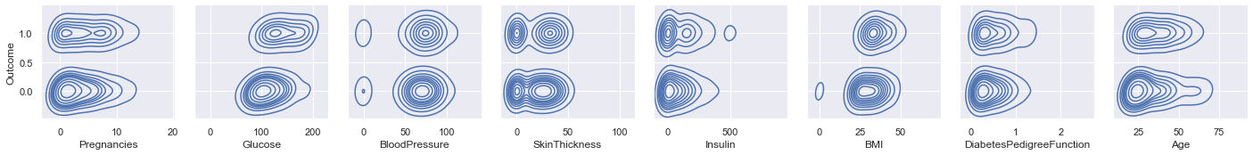
Use PairGrid to cycle through all features in order to depict their relationships to Outcome.
x_vars = ['Pregnancies',
          'Glucose',
          'BloodPressure',
          'SkinThickness',
          'Insulin',
          'BMI',
          'DiabetesPedigreeFunction',
          'Age']
y_vars = ['Outcome']
g = sns.PairGrid( pima_df,
                  x_vars = x_vars,
                  y_vars = y_vars)
g.map_offdiag(sns.kdeplot)
g.map_diag(sns.histplot)
g.add_legend
Glucose and BMI appear to have a tiny bit of correlation with Outcome, based on the left/ right orentation of the density blobs.
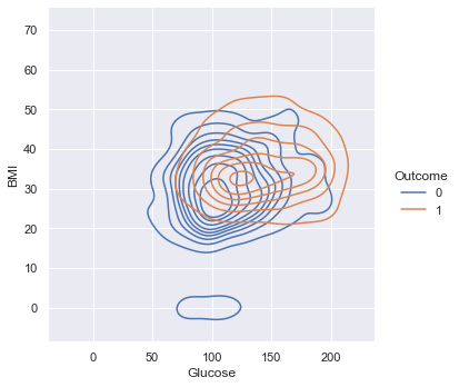
A KDE plot provides an overhead, three-dimensional view of the relationships between Glucose, BMI and Outcome.
sns.displot( x = pima_df['Glucose'],
             y = pima_df['BMI'],
             hue =  pima_df['Outcome'],
             kind = 'kde')
Based on the near-total overlap, the two features do not provide enough data to predict Outcome.
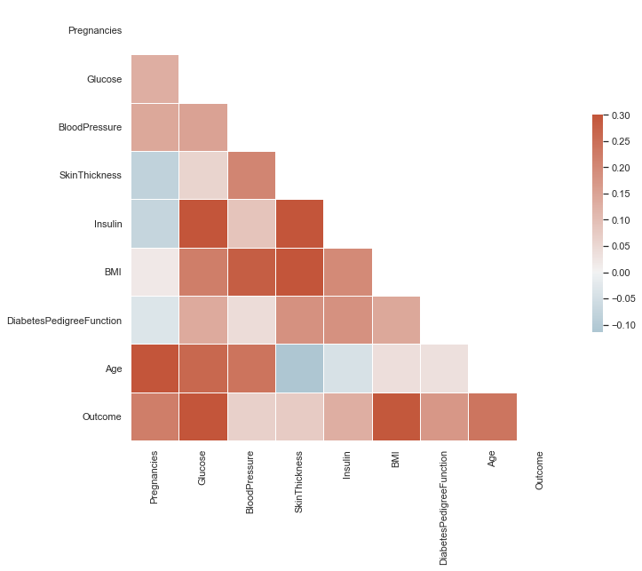
A Seaborn heat map visualizes correlations across features.
import matplotlib.pyplot as plt

sns.set_theme(style="white")
corr = pima_df.corr()

# Generate a mask for the upper triangle
mask = np.triu(np.ones_like(corr,
                            dtype=bool))

# Set up the matplotlib figure
f, ax = plt.subplots(figsize=(11, 9))

# Generate a custom diverging colormap
cmap = sns.diverging_palette(230,
                             20,
                             as_cmap=True)

# Draw the heatmap with the mask and
# correct aspect ratio
sns.heatmap(corr,
            mask=mask,
            cmap=cmap,
            vmax=.3,
            center=0,
            square=True,
            linewidths=.5,
            cbar_kws={"shrink": .5})
Look for dark red tiles in the Outcome row. The dark red tiles of Glucose and BMI indicate stronger correlation with Outcome vs. other features.
Explore Three Features
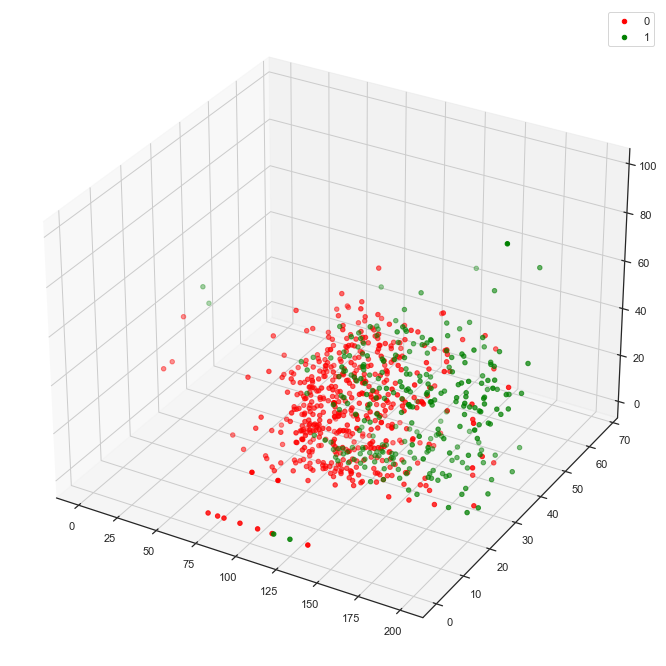
Create a function to plot three features against Outcome.
import matplotlib.pyplot as plt

def plot_3d(df, target, feature1,
            feature2, feature3):
    fig = plt.figure(figsize = (12, 12))
    ax1 = fig.add_subplot(111,
                          projection='3d')

    x3 = df.loc[df[target] == 0][feature1]
    y3 = df.loc[df[target] == 0][feature2]
    z3 = df.loc[df[target] == 0][feature3]
    ax1.scatter(x3,
                y3,
                z3,
                label = 0,
                color = "red")

    x3 = df.loc[df[target] == 1][feature1]
    y3 = df.loc[df[target] == 1][feature2]
    z3 = df.loc[df[target] == 1][feature3]
    ax1.scatter(x3,
                y3,
                z3,
                label = 1,
                color = "green")

    ax1.legend()
The following function call, for example, draws a 3d plot that visualizes Glucose, BMI and SkinThickness against Outcome.
plot_3d(pima_df,
        'Outcome',
        'Glucose',
        'BMI',
        'SkinThickness')
This plot depicts slight separation between the two classes.
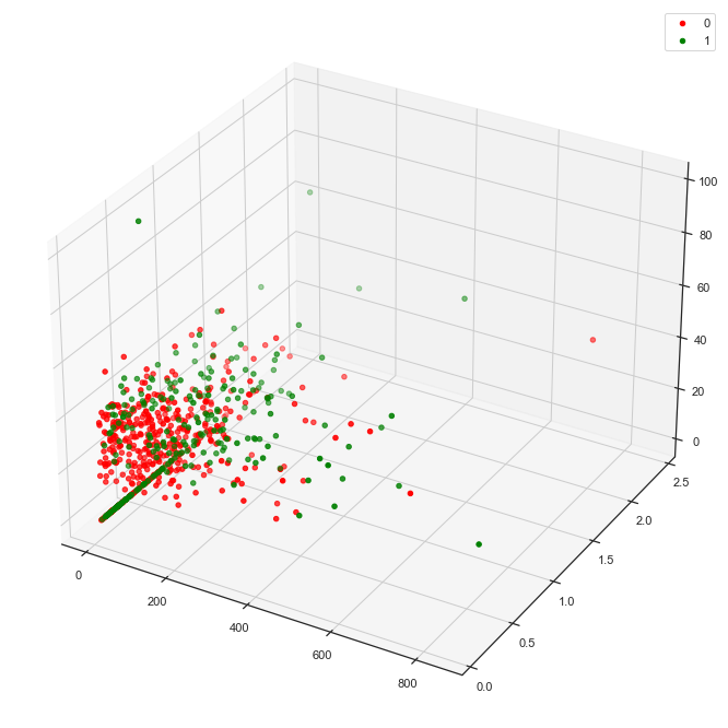
Pick two new features, Insulin and DiabetesPedigreeFunction for another view.
plot_3d(pima_df,
        'Outcome',
        'Insulin',
        'DiabetesPedigreeFunction',
        'SkinThickness')
This combination yields significantly less separability of the classes than the combination of Glucose, BMI and SkinThickness above.
Normalize
First, split the pima_df DataFrame into train and test.
- Train - Data to build our exemplar model
- Test (AKA Hodout) - Unseen data to help predict real-world performance
train_dataset = pima_df.sample(frac=0.8,
                               random_state = 0)

# Remove the rows that correspond to the train DF
test_dataset = pima_df.drop(train_dataset.index)

train_features = train_dataset.copy()
test_features = test_dataset.copy()

# The pop removes Outcome from the features DF
train_labels = train_features.pop('Outcome')
test_labels = test_features.pop('Outcome')
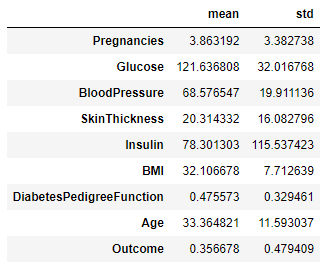
Observe the summary statistics of the features.
train_dataset.describe().transpose()[['mean','std']]
We see big differences in the range of values for each feature, so we must normalize the data to comply with Machine Learning (ML) best practices.
Keras provides tools for Normalization.
import tensorflow as tf
from tensorflow import keras
from tensorflow.keras import layers
from tensorflow.keras.layers.experimental import preprocessing
normalizer = preprocessing.Normalization()
normalizer.adapt(np.array(train_features))
(pd
.DataFrame(normalizer(train_features)
.numpy(), columns = ['Pregnancies',
'Glucose',
'BloodPressure',
'SkinThickness',
'Insulin',
'BMI',
'DiabetesPedigreeFunction',
'Age'],
index = train_features.index)
.plot
.hist(subplots=True,
layout = (4,2),
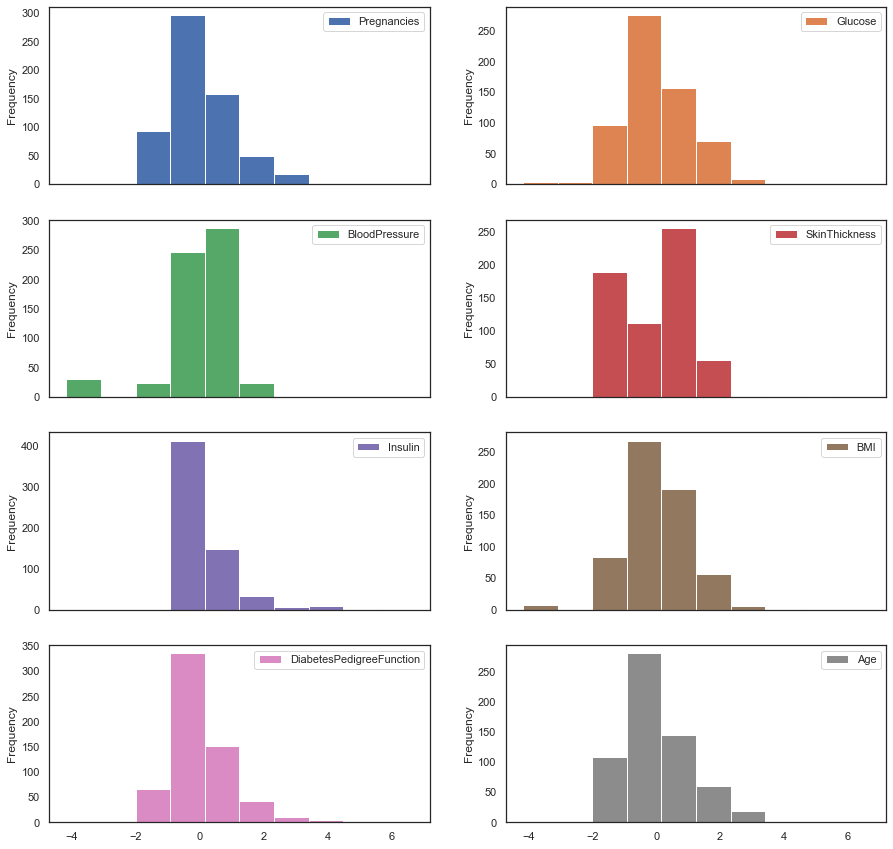
figsize = (15,15)))
The features cluster around zero post-normalization.
Reduce Dimensionality
The correlation heatmap above indicates strong correlation between some features. Highly correlated features input redundancy (noise) into our model. Principal Component Analysis (PCA) maps the features onto orthogonal planes and also provides a means to reduce dimensions. Too many dimensions (features) leads to over-fitting which reduces the predictive effectiveness of ML models.
Open George Dallas' blog post in a new tab for an excellent explanation of PCA
Apply PCA to the Pima DataFrame in order to reduce noise and reduce the number of dimensions.
Create a PCA transform engine, set the number of principal components via n_components and then have the engine fit to the normalized train_features DataFrame.
from sklearn.decomposition import PCA
pca = PCA(n_components=1)
pca.fit(normalizer(train_features))
Store the normalized, dimensionality reduced matrix in a data frame and set the column name.
pca_train_features_df = pd.DataFrame(pca.transform(normalizer(train_features)),
                                     columns = ['princomp1'],
                                     index=train_features.index)
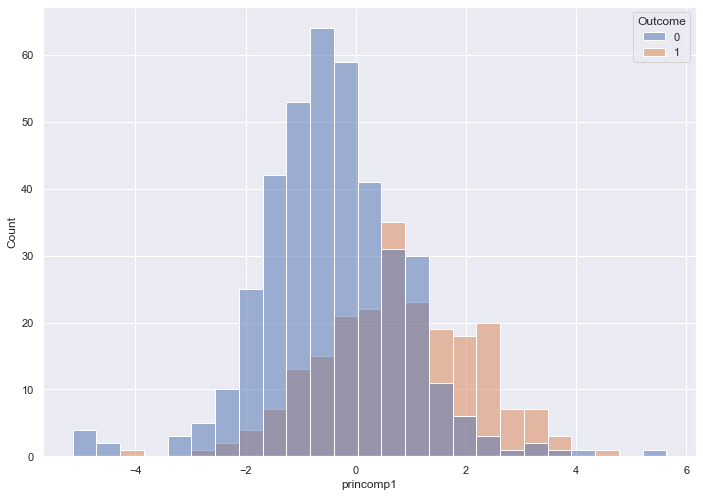
See if the single Principal Component provides better separability for each class over our original Glucose histogram.
import seaborn as sns
sns.set( rc = { 'figure.figsize' : (11.7, 8.27)})
sns.histplot( x = pca_train_features_df['princomp1'],
              hue = train_labels)
The histogram captures near-total overlap, which indicates we will need more than one Principal Component
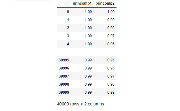
Create a new data frame that includes two Principal Components.
pca = PCA(n_components=2)
pca.fit(normalizer(train_features))
pca_train_features_df = pd.DataFrame(pca.transform(normalizer(train_features)),
                                     columns = ['princomp1',
                                                'princomp2'],
                                     index=train_features.index)
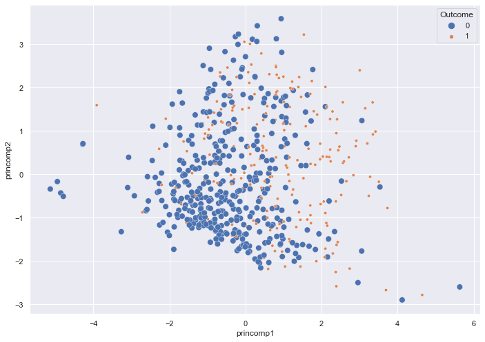
Observe a two dimensional scatterplot, colored by Outcome.
sns.scatterplot(x = pca_train_features_df['princomp1'],
                y = pca_train_features_df['princomp2'],
                hue = train_labels,
                size = train_labels)
Two Principal Components reduce the overlap of the two classes slightly.
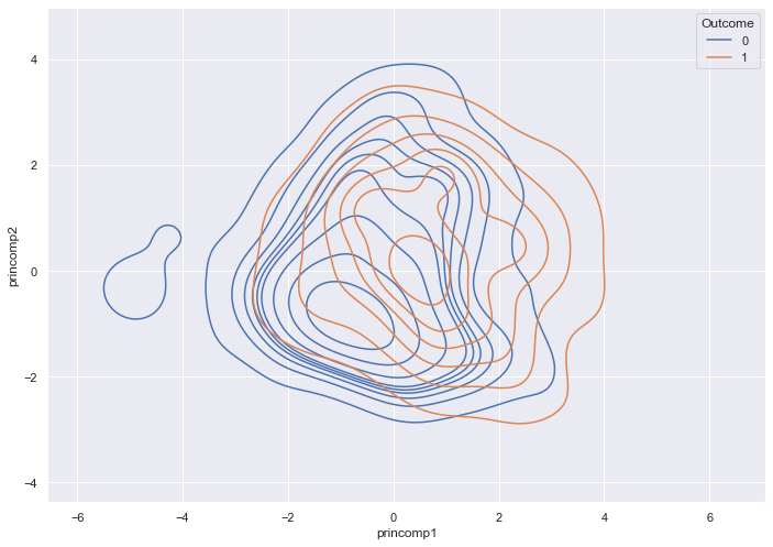
A density plot provides another view of the Outcomes.
sns.kdeplot( data = pca_train_features_df,
             x = pca_train_features_df['princomp1'],
             y = pca_train_features_df['princomp2'],
             hue = train_labels,
             fill = False)
The most dense regions of the two outcomes overlap.
How many components do we need? The following code records the variance for each component. Higher variance means more information.
pca = PCA(n_components=8)
pca.fit(normalizer(train_features))
print(pca.explained_variance_)
# 2.09525231 1.67097928 1.04292129 0.88878235 0.76897059 0.69332725
# 0.4365278  0.41629126
The first three to five components include most of the useful information.
The following code produces and stores three components.
pca = PCA(n_components=3)
pca.fit(normalizer(train_features))
pca_train_features_df = pd.DataFrame(pca.transform(normalizer(train_features)),
                                     columns = ['princomp1',
                                                'princomp2',
                                                'princomp3'],
                                     index=train_features.index)
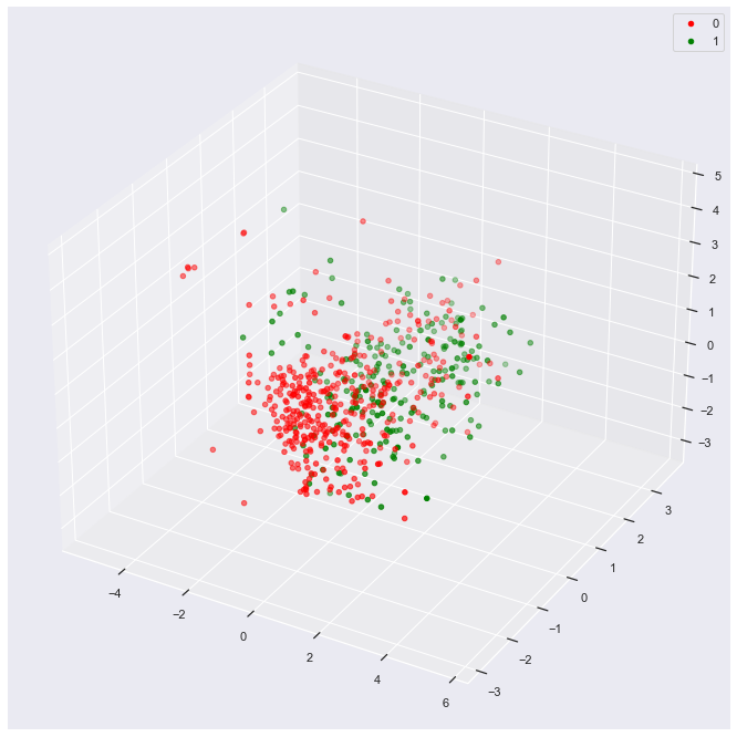
Attach the labels back to the train DataFrame for purposes of a 3d plot.
data_df = pca_train_features_df.assign(outcome=train_labels)
plot_3d(data_df,
        'outcome',
        'princomp1',
        'princomp2',
        'princomp3')
The result shows slight separability of the two classes if you imagine sliding a sheet of paper between the clouds of green and red dots.
Develop Model
We will use a 2d train data set to walk through model development.
pca = PCA(n_components=2)
pca.fit(normalizer(train_features))
pca_train_features_df = pd.DataFrame(pca.transform(normalizer(train_features)),
                                     columns = ['princomp1',
                                                'princomp2'],
                                     index=train_features.index)
We re-attach the train labels to our DataFrame. Our exemplar algorithm requires knowledge of the labels for supervised learning.
train_df = pca_train_features_df.assign(outcome = train_labels)
Calculate Lambda
The following function finds the radii (lambda) for each row. For a given observation, it calculates the euclidean distance to every observation of the opposite class, and then returns the closest point.
(Note the complete absence of any for statements in the code below.)
def find_lambda(df, v):
  return ( np
            .linalg
            .norm(df
                    .loc[df['outcome'] != v[-1]]
                    .iloc[:,:-1]
                    .sub(np
                           .array(v[:-1])),
                  axis = 1)
            .min())
For an example, look at row one of our training DataFrame.
print(train_df.iloc[1,:])
That observation belongs to Outcome 0 (no diabetes), and lies at the point (-0.05, -1.16).
princomp1   -0.046671
princomp2   -1.161939
outcome      0.000000
Name: 122, dtype: float64
Pass this observation to our find_lambda function, which returns the distance to the nearest observation in Outcome 1.
find_lambda(train_df,train_df.iloc[1,:])
Our function indicates that the closest observation in Outcome 1 lies 0.09 units away.
0.0893789327564675
The Pandas apply method allows us to follow a Functional Programming approach and process the entire DataFrame at once.
train_df['lambda'] = train_df.apply(lambda X: find_lambda(train_df, X),
                                    axis = 1)
The following table captures the resulting lambda for a handful of example training observations.

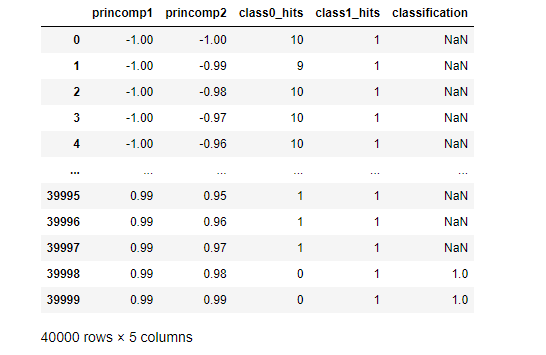
Classify Test Data
Test data does not include a label. The ML Engineer feeds test data into the trained model, and the model predicts a label.
We will now develop the logic to predict a label.
In order to demonstrate the logic, we produce a grid of test points. The grid will also feed a visualization of the RCE decision boundaries.
class_df = pd.DataFrame([(x,y) for x in range(-100,100) for y in range(-100,100)],
                        columns = ['princomp1',
                                   'princomp2'])/100
Our grid includes the following test data.
Our RCE algorithm uses the find_lambda function (above) to calculate lambda for each observation in the train DataFrame and stores the results in the train_df DataFrame. Recall that Lambda represents the radius of a circle that captures the hit footprint for a given observation.
Our find_hits function (below) takes a given test observation and then calculates the euclidean distance to every point in train_df. A test point to train point distance less than the train point's lambda indicates that the test point lies in the train point's hit footprint.
For a given test observation, our find_hits function discovers and tallies the hits for each class.
def find_hits(df, v, outcome ):
  return (( np
            .linalg
            .norm(df
                    .loc[df['outcome'] == outcome]
                    .iloc[:,:-2]
                    .sub(np
                           .array(v)),
                  axis = 1)
             < df.loc[df['outcome'] == outcome]['lambda'] ).sum() )
Row one of our test DataFrame, for example, includes the unlabeled point (-1,-0.99)
class_df.iloc[1,:]
princomp1   -1.00
princomp2   -0.99
For this point, find_hits tallies 9 hits for Outcome 0.
find_hits(train_df,class_df.iloc[1,:],0)
9
find_hits drives the classify_data function, which labels the class based on hits for each class.
classify_data returns Ambiguous or NaN for any test_data that lies in an Ambiguous region (region with overlapping classes or region with no class).
def classify_data(training_df, class_df):
    # find the hits
    class0_hits = class_df.apply(lambda X: find_hits(training_df, X, 0),axis = 1)
    class1_hits = class_df.apply(lambda X: find_hits(training_df, X, 1),axis = 1)
    # add the columns
    class_df = class_df.assign( class0_hits = class0_hits)
    class_df = class_df.assign( class1_hits = class1_hits)
    # ID ambiguous, class 0 and class 1 data
    class_df['classification'] = np.nan
    class_df['classification'] = class_df.apply(lambda X: 0 if X.class0_hits > 0 and X.class1_hits == 0 else X.classification, axis = 1)
    class_df['classification'] = class_df.apply(lambda X: 1 if X.class1_hits > 0 and X.class0_hits == 0 else X.classification, axis = 1)
    return class_df
Pass our test DataFrame to classify_data and store the results.
class_df = classify_data(train_df, class_df)
A quick peek shows mostly Ambiguous classification for the first and last five observations in our test DataFrame.
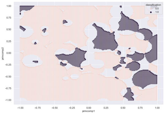
A Seaborn scatterplot maps our entire grid.
sns.scatterplot(x = class_df['princomp1'],
                y = class_df['princomp2'],
                hue = class_df['classification'])
The following graphic captures the footprint of each class. Purple for Outcome 1 (Diabetes), Pink for Outcome 0 (No Diabetes) and Gray for Ambiguous.
Evaluate RCE
Our Pima test DataFrame includes labels, which we use to evaluate the model.
To prepare the test DataFrame for classification, we normalize and PCA transform the DataFrame.
pca = PCA(n_components=2)
pca.fit(normalizer(test_features))
test_df = pd.DataFrame(pca.transform(normalizer(test_features)),
                                     columns = ['princomp1',
                                                'princomp2'],
                                     index=test_features.index)
We pass this test_df to classify_data.
test_df = classify_data(train_df, test_df)
Seaborn provides a method to depict a confusion matrix. We attach the known test labels to the test DataFrame for scoring.
test_df = test_df.assign(actual=test_labels)
confusion_matrix = pd.crosstab(test_df['actual'],
                               test_df['classification'],
                               rownames=['Actual'],
                               colnames=['Predicted'])

sns.heatmap(confusion_matrix,
            annot=True)
plt.show()
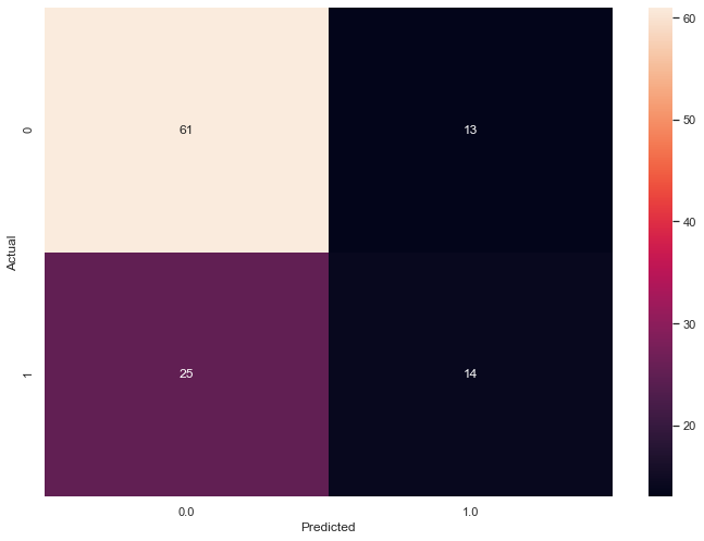
The following graphic captures the confusion matrix for our two Principal Component test DataFrame.
An F1 Score provides a usesful success metric.
from sklearn.metrics import f1_score

def calc_success(test_df):
    unambiguous_df = test_df.dropna()
    ambiguity = (test_df.shape[0] - unambiguous_df.shape[0])/test_df.shape[0]
    f1 = f1_score(unambiguous_df.actual,
                  unambiguous_df.classification)
    return { "f1_score" : f1,
             "ambiguity" : ambiguity}
Our RCE algorithm trained a model with an F1 Score of 0.42 and ambiguity of 26.6%.
calc_success(test_df)
{'f1_score': 0.42424242424242425,
 'ambiguity': 0.2662337662337662}
Conclusion
In this blog post we developed an exemplar RCE neural net classifier from scratch. Our initial attempt yielded a model with an F1 Score of 0.42 and ambiguity of 26.6%. Next month, we will tune hyperparameters in order to improve model success and reduce ambiguity. We will investigate the number of principal components and tune r. r indicates the maximum value for Lambda and puts an upper limit on the maximum size of each circle that represents a given hit footprint.