Today I collect and organize useful data visualization (Data Viz) tools that aid data exploration.
I illustrate the use of the tools via the classic Abalone database, hosted on the University of California, Irvine (UCI) Machine Learning repository website.
I recommend you bookmark this and return to it when you need to find the syntax and semantics of popular data viz constructs.
Get the Data
PhD student David Aha created the University of California, Irvine (UCI) Machine Learning repository in 1987 in the form of a File Transfer Protocol (FTP) site. The Repo collects databases, domain theories, and data generators. Today I use the Abalone database.
The Abalone database provides a table of four thousand observations, which each contain one categorical feature, seven continuous features, and one target:
- Features, Categorical
- Sex: Male, Female, and Infant
- Features, Continuous
- Length: Longest shell measurement (mm)
- Diameter: Perpendicular to length (mm)
- Height: With meat in the shell (mm)
- Whole_weight: Whole abalone (grams)
- Shucked_weight: Weight of meat (grams)
- Viscera_weight: Gut weight after bleeding (grams)
- Shell_weight: After being dried (grams)
- Target, Integer
- Rings: +1.5 gives the age in years
I use the Python requests library to pull the data straight from the UCI repo and stuff it into a Pandas DataFrame.
I import the required libraries.
import pandas as pd
import numpy as np
import io
import requests
import seaborn as sns
I set the url (String) and column_name (List) variables to match the Abalone database schema.
url = 'https://archive.ics.uci.edu/ml/machine-learning-databases/abalone/abalone.data'
column_names = ['Sex',
                'Length',
                'Diameter',
                'Height',
                'Whole_weight',
                'Shucked_weight',
                'Viscera_weight',
                'Shell_weight',
                'Rings']
Requests downloads the HTTP object, StringIO decodes it and Pandas loads the decoded data into a DataFrame.
r = requests.get(url).content
abalone_df = pd.read_csv(io.StringIO(r.decode('utf-8')),
                      names = column_names)
One-Dimensional Statistical Summaries
We first explore the data in one dimension.
Histograms
Histograms provide a visual shorthand for the distribution of numerical data. Think of a connect four board, where you stack chips in different columns (or buckets). Each chip represents a number in that bucket.
Pandas provides a built-in hist() method.
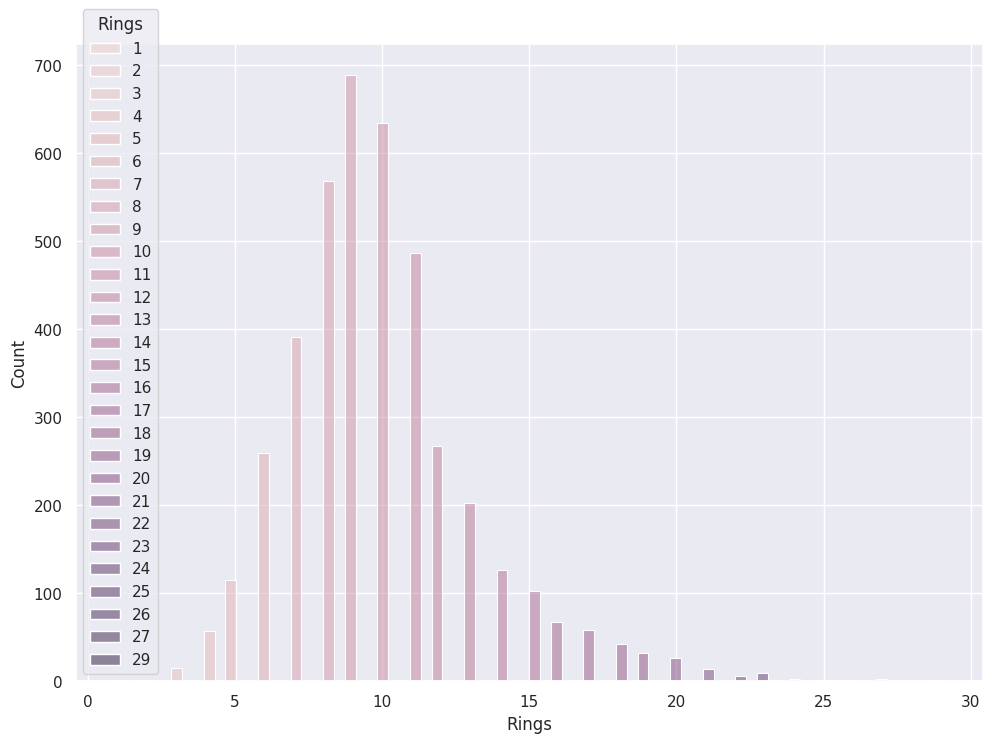
abalone_df['Rings'].hist()
We use Pandas to draw a Histogram of our target variable, Rings.
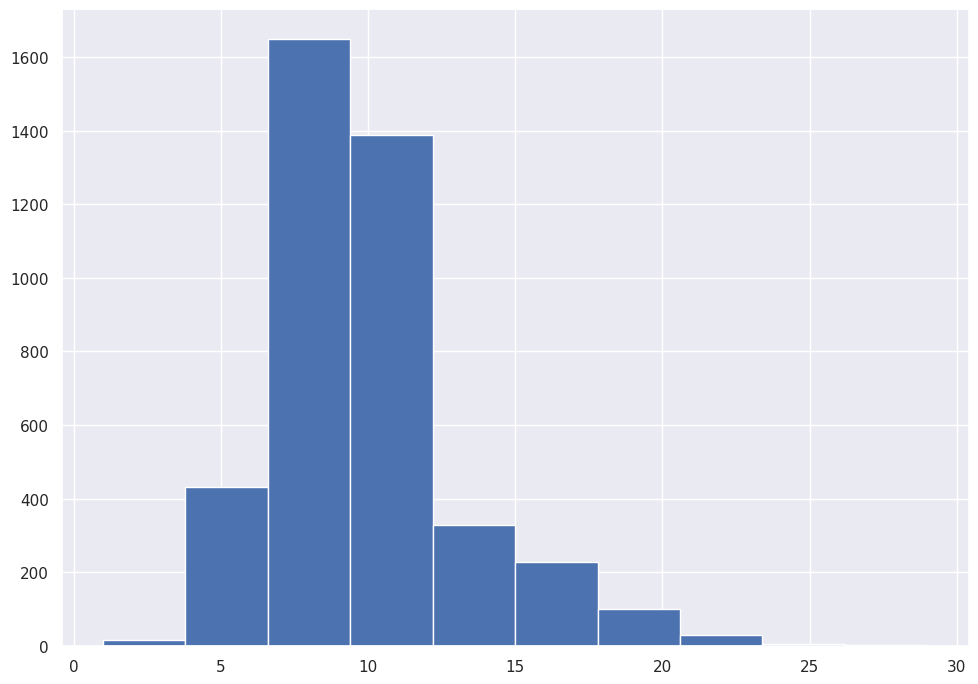
Most Abalone include between 7.5 and 12.5 Rings.
Pandas also accommodates our Categorical feature.
abalone_df['Sex'].hist()
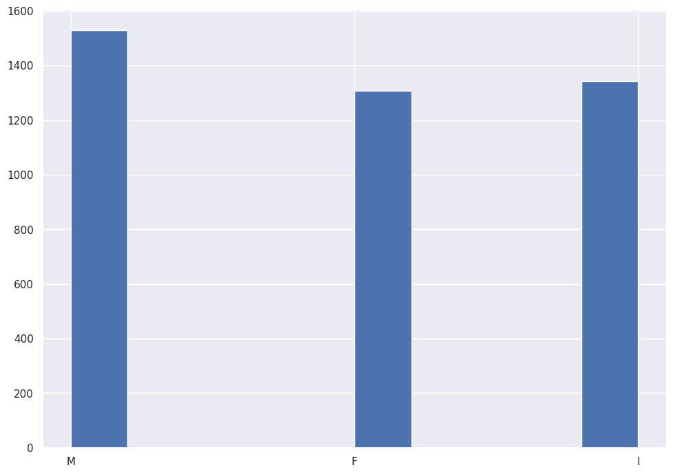
The corpus of data includes roughly equal observations for Male, Female and Infant.
Pandas allows us to run histograms on all features. The method ignores the Categorical feature.
abalone_df.plot.hist(subplots=True,layout=(4,2))
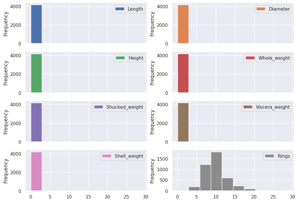
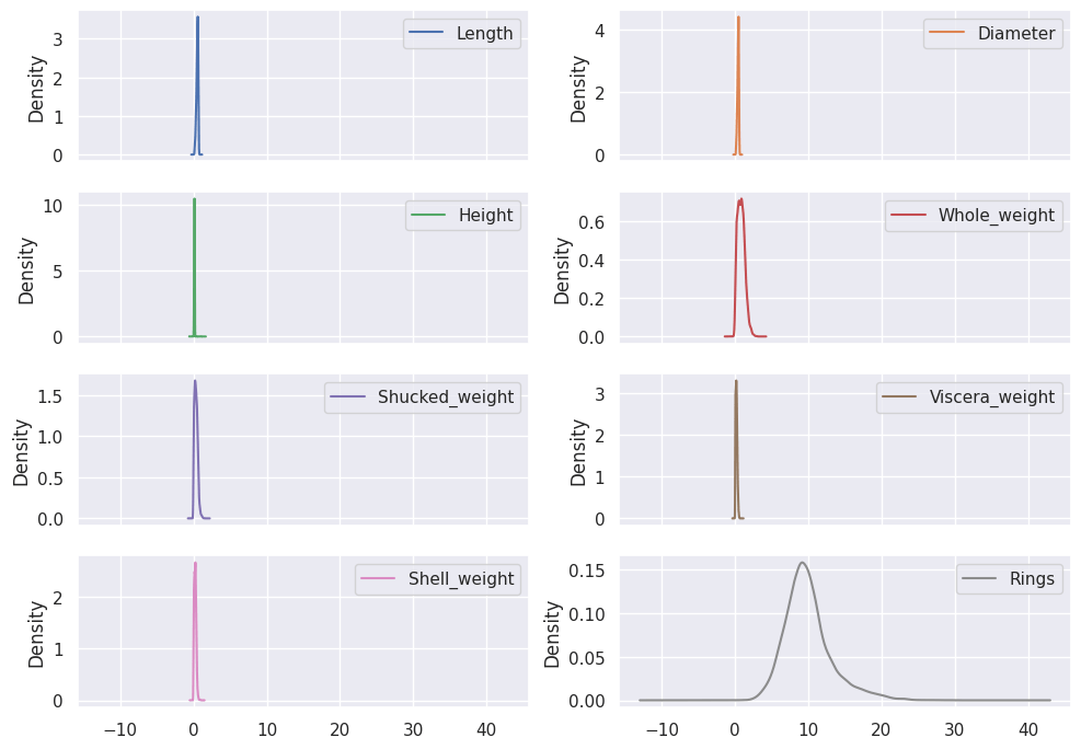
The results illustrate the need to Normalize the data, since all the Categorical features clock in under a value of one (1), and the target feature includes ranges up to thirty (30).
Hist with tags
InfluxDB uses the nomenclature Tags and Measurements to describe Categorical and Continuous variables.
Tags provide a new dimension of visual data, slicing and dicing the data into different categories.
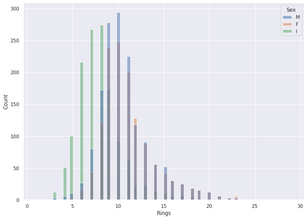
Seaborn provides the option to color by Tag with their hue parameter.
sns.histplot(data=abalone_df, x='Rings',hue='Sex')
Hue does not make sense with Measurements:
sns.histplot(data=abalone_df, x='Rings',hue='Rings')
Kernel Density Estimation (KDE)
Kernel Density Estimation (KDE) smooths the Histograms. Instead of discrete buckets, we see continuous lines that represent the distribution.
I used the analogy above of a Histogram stacking chips on a connect four board. KDE pours sand at each point, enough to fill a Standard Normal Distribution. KDE in a sense stacks Standard Normal Distributions at each point, which leads to the smoothness of the plot.
If you reduce the bucket size to a very small number, you can see the idea in action.
abalone_df['Whole_weight'].hist()
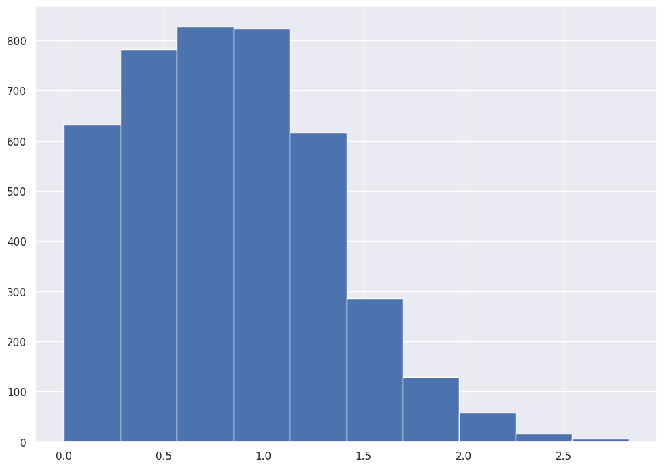
abalone_df['Whole_weight'].hist(bins=25)
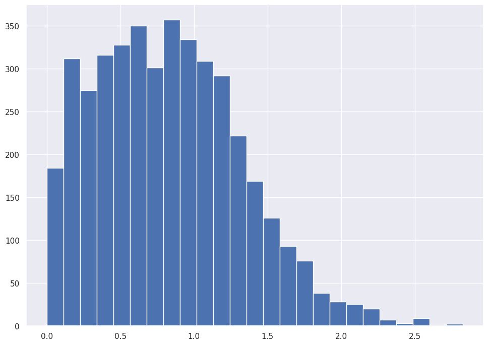
abalone_df['Whole_weight'].hist(bins=50)
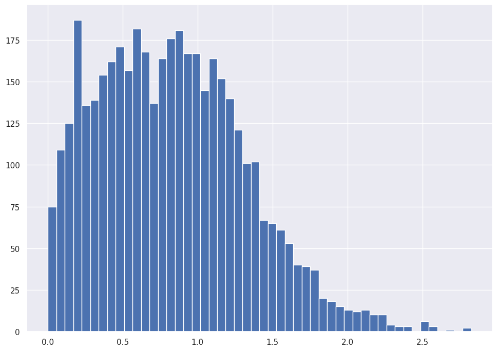
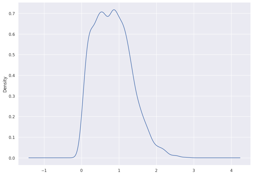
abalone_df['Whole_weight'].plot.kde()
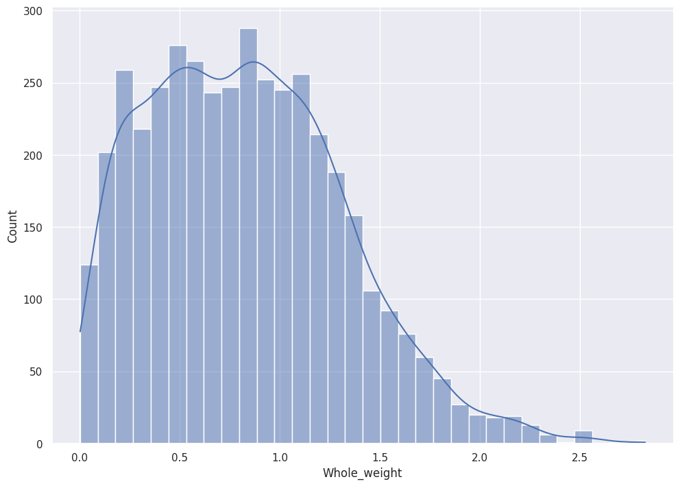
SNS will plot the KDE over the histogram if you instruct it to do so:
sns.histplot(data=abalone_df, x="Whole_weight", kde=True)
Pandas plots all features' distribution with KDE.
abalone_df.plot.kde(subplots=True,layout=(4,2))
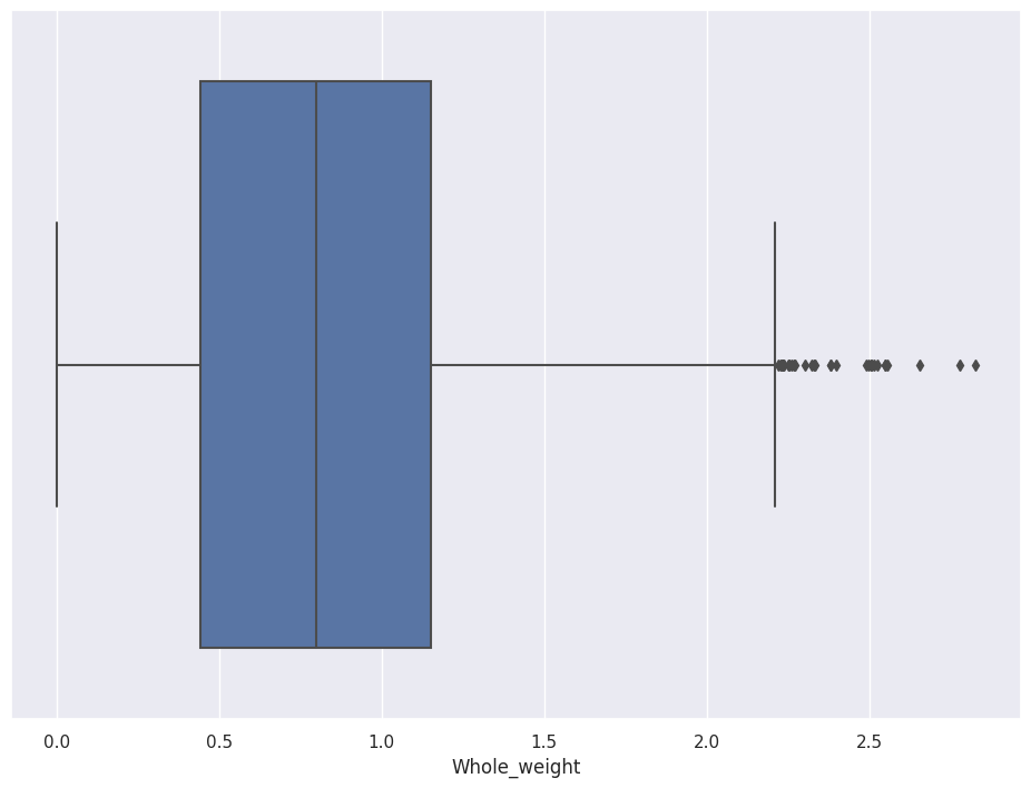
Boxplots
A glance at a Boxplot tells you the median, 25th percentile, 75th percentile, and outliers.
The box shows the First and Third quartiles and the whiskers show data points that lie 1.5 times the Interquartile range (IQR) (for both top and bottom).
sns.boxplot(data=abalone_df, x='Whole_weight')
SNS allows you to separate the chart by Tag. If you set y equal to Sex, for example, you see the distributions split by Male, Female, and Infant.
sns.boxplot(data=abalone_df, x='Whole_weight',y='Sex')
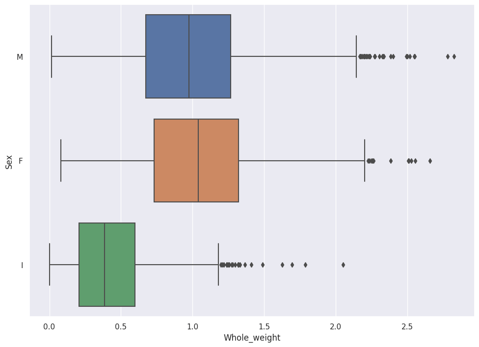
In the Boxplot above, we see that Female Abalone weigh slightly more than Male Abalone.
Special Note: Enrich Data.
Remember that we have a target variable named Rings, which encompasses a range of numbers between one (1) and thirty (30). I recommend you enrich the Rings data with a new Tag.
The following code uses the Rings value to set a new Tag, which I named Age. The code splits the data into three ranges and applies to a given observation the tag Young, Middle_Age or Old based on the value of Rings.
abalone_df['Age'] = pd.qcut(abalone_df['Rings'],q=3,labels=['Young','Middle_Age','Old'])
abalone_df.head()
This new tag provides a new dimension to slice and dice our Boxplot.
sns.boxplot(data=abalone_df, x='Whole_weight',y='Sex',hue='Age')
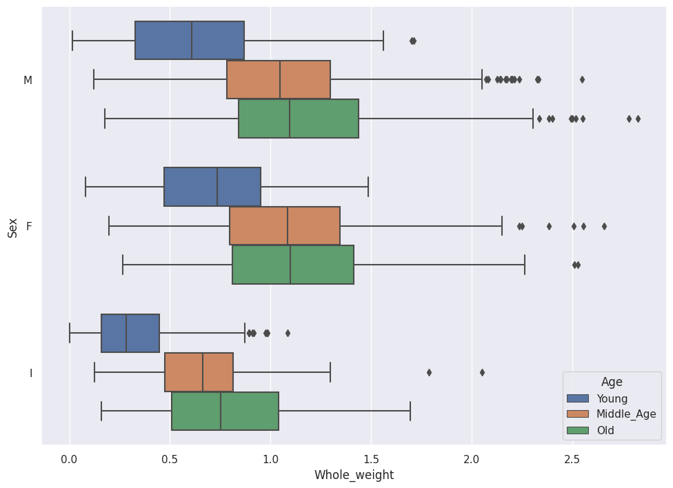
We now see the relationship between Whole_weight, Sex and Age at a glance.
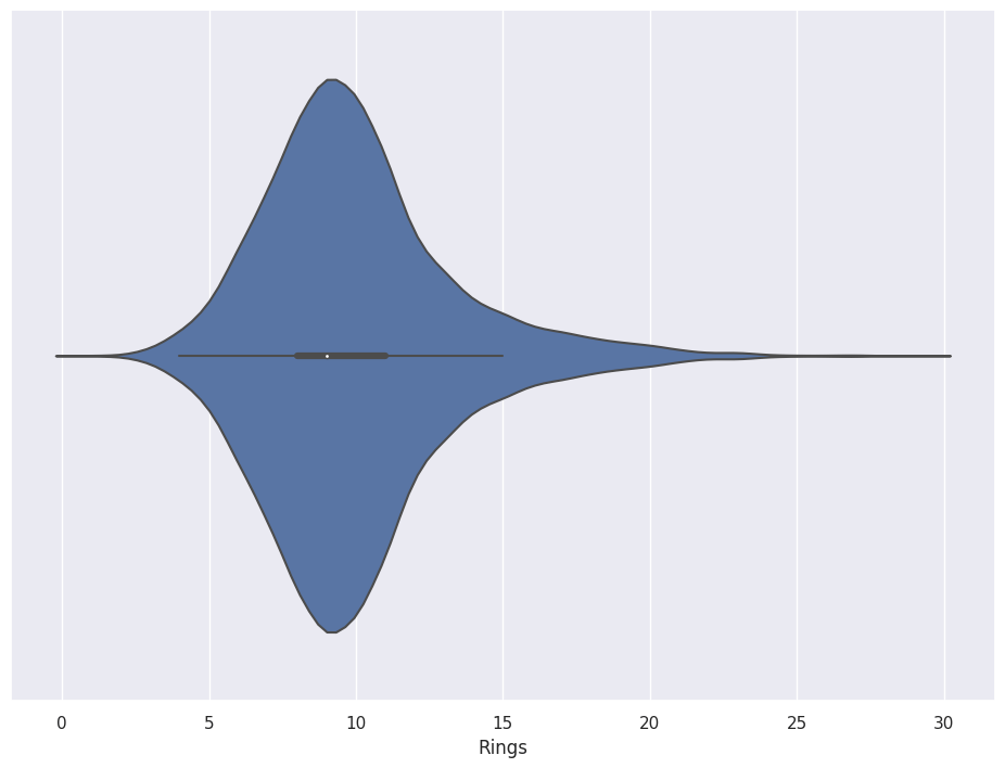
Violinplots
A Violinplot mirrors the Distribution, which gives the plot a Violin-like shape.
sns.violinplot(x=abalone_df['Rings'])
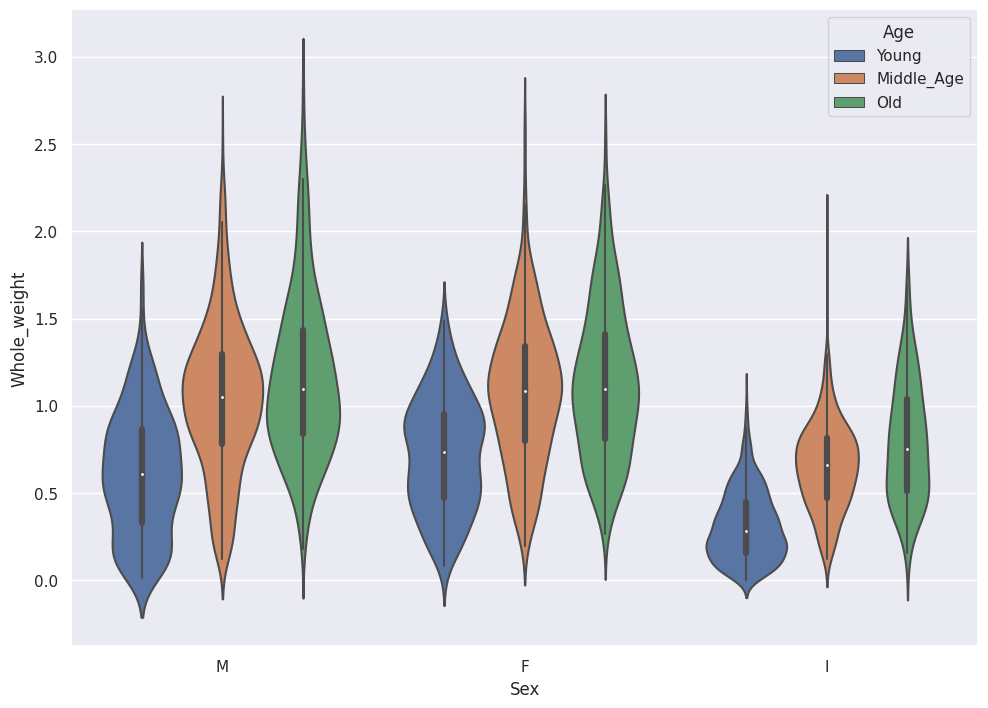
Violinplots also accommodate Tags.
sns.violinplot(data=abalone_df,x='Sex',y='Whole_weight',hue='Age')
Two-dimensional Plots
Python provides tools to explore Bivariate data sets.
Seaborn (SNS) provides two-dimensional Histograms and two-dimensional KDE tools.
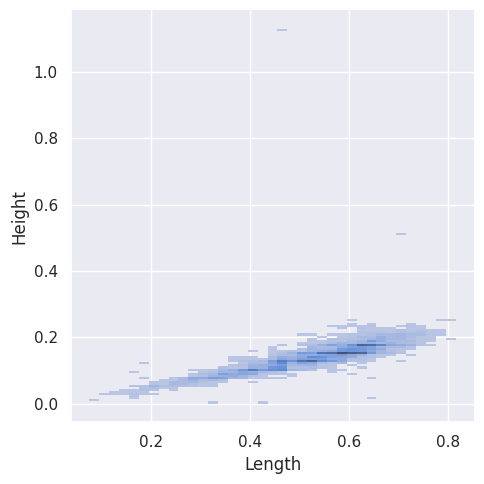
Two-dimensional Histogram
Note that SNS only shows the top-down view for histograms.
sns.displot(abalone_df, x="Length", y="Height")
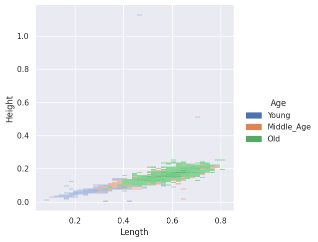
The SNS Bivariate Histograms accommodate tags.
sns.displot(abalone_df, x="Length", y="Height", hue="Age")
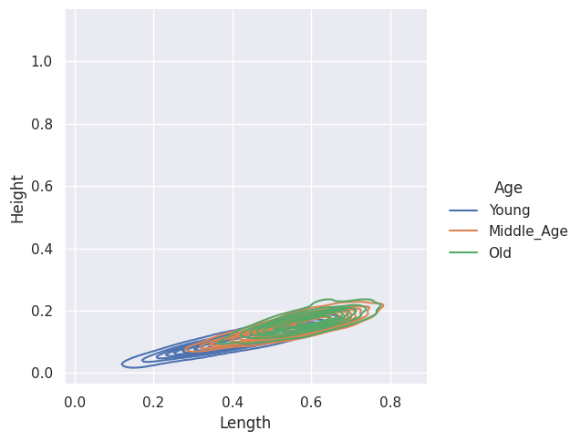
Two-dimensional KDE
SNS also provides two-dimensional KDE plots, with Tags.
sns.displot(abalone_df, x="Length", y="Height", hue="Age", kind="kde")
Look for Correlation
The Data Scientist looks for correlation between features and the target during the Data Exploration phase of the Machine Learning Pipeline
Data prep
In the Data Prep stage, we encode the Tags (String) into numeric values (float32).
The Pandas method get_dummies one-hot-encodes the Sex variable into Orthogonal dimensions. This increases the dimensionality of our data set.
We also use the factorize method to convert Young, Middle_Aged and Old into the integers 0,1 and 2.
abalone_reg_df = abalone_df.join(pd.get_dummies(abalone_df['Sex']))
abalone_reg_df['Age_Bucket'] = pd.factorize(abalone_df['Age'],sort=True)[0]
abalone_reg_df = abalone_reg_df.drop(['Sex','Age'],axis=1).astype(np.float32)
We pop off the labels for later use.
class_labels stores the target vector for Classification models, and reg_labels stores the target vector for Regression models.
class_labels = abalone_reg_df.pop('Age_Bucket')
reg_labels = abalone_reg_df.pop('Rings')
I also create vectors to pull like Features from the DataFrame (Measurements, Tags, Target).
metric_vars = ['Length',
               'Diameter',
               'Height',
               'Whole_weight',
               'Shucked_weight',
               'Viscera_weight',
               'Shell_weight']

encoded_vars = ['F',
                'I',
                'M']

y_vars = ['Rings']
Heatmap correlation
SNS provides a Heatmap matrix for correlation.
import matplotlib as plt

corr = abalone_reg_df.corr()

# Generate a mask for the upper triangle
mask = np.triu(np.ones_like(corr,
                            dtype=bool))

# Set up the matplotlib figure
f, ax = plt.subplots(figsize=(11, 9))

# Generate a custom diverging colormap
cmap = sns.diverging_palette(230,
                             20,
                             as_cmap=True)

# Draw the heatmap with the mask and
# correct aspect ratio
sns.heatmap(corr,
            mask=mask,
            cmap=cmap,
            vmax=1,
            center=0,
            square=True,
            linewidths=.5,
            cbar_kws={"shrink": .5})
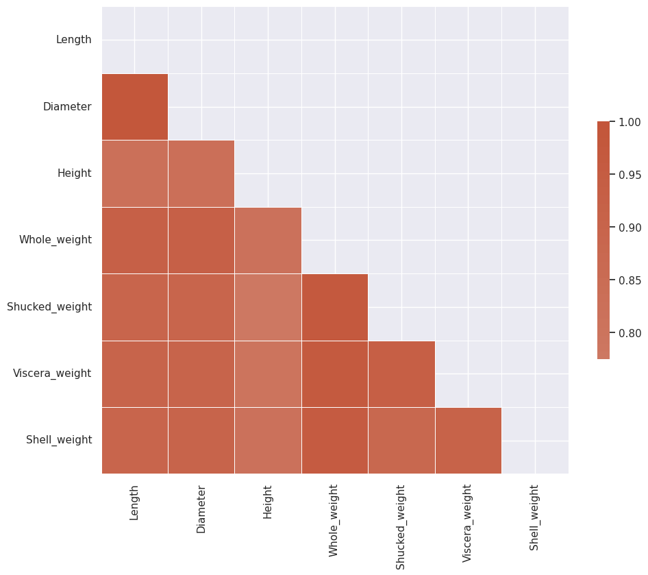
We see that Diameter and Length have significant correlation and so do all of the weight features.
Pairgrid Correlation
This SNS Pairgrid plot shows the correlation between the features and the target, Rings.
g = sns.PairGrid(abalone_df,
                 x_vars = metric_vars,
                 y_vars = y_vars)
g.map_offdiag(sns.kdeplot)
g.add_legend()
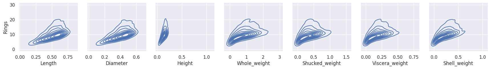
All features depict a correlation slope close to around 25 degrees or so, which indicates Correlation.
Scatterplot with Regression
SNS plots the ML 101 favorite, Linear Regression right on the screen with the regplot action.
sns.regplot(x = abalone_df['Viscera_weight'],
                y = abalone_df['Rings'])
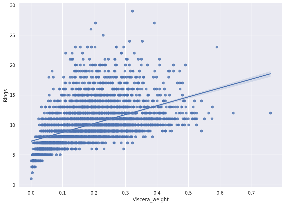
We see positive slope with pretty tight error bands, which indicates Viscera_weight predicts Rings.
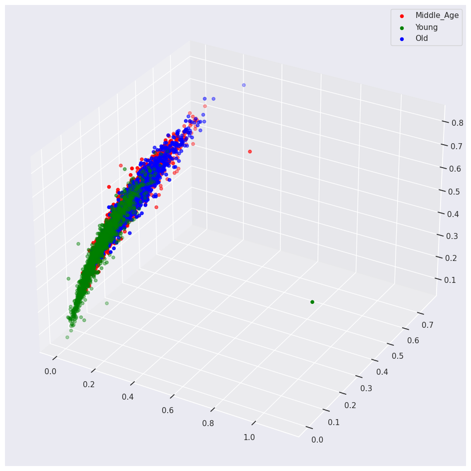
Fancy Tilted 3d Plots
Remember that SNS only graphs top-down views. I wrote the following matplotlib function to show an isometric view of the data.
def plot_3d(df, target, feature1,
            feature2, feature3):
    target_list = list(set(df[target]))
    fig = plt.figure(figsize = (12, 12))
    ax1 = fig.add_subplot(111,
                          projection='3d')

    x3 = df.loc[df[target] == target_list[0]][feature1]
    y3 = df.loc[df[target] == target_list[0]][feature2]
    z3 = df.loc[df[target] == target_list[0]][feature3]
    ax1.scatter(x3,
                y3,
                z3,
                label = target_list[0],
                color = "red")

    x3 = df.loc[df[target] == target_list[1]][feature1]
    y3 = df.loc[df[target] == target_list[1]][feature2]
    z3 = df.loc[df[target] == target_list[1]][feature3]
    ax1.scatter(x3,
                y3,
                z3,
                label = target_list[1],
                color = "green")

    x3 = df.loc[df[target] == target_list[2]][feature1]
    y3 = df.loc[df[target] == target_list[2]][feature2]
    z3 = df.loc[df[target] == target_list[2]][feature3]
    ax1.scatter(x3,
                y3,
                z3,
                label = target_list[2],
                color = "blue")

    ax1.legend()
I call the function with the Abalone data.
plot_3d(abalone_df,
        'Age',
        'Height',
        'Viscera_weight',
        'Length')
Dimensionality Reduction
Note my Graph above requires me to choose three (out of the possible eight) features at a time. This fact drives two questions:
- Which features do I use?
- How can I plot all the features at once?
Principal Component Analysis (PCA) collapses the information held in eight features into three, two or even one feature.
I write about PCA in my blog post on Regression with Keras and TensorFlow
If you stick a magnet at each point in the data space, and then stick a telescoping iron bar at the origin, the magnets will pull the bar into position and stretch the bar. The bar will wiggle a bit at first and then eventually settle into a static position. The final direction and length of the bar represent a principal component. We can map the higher dimensionality space to the principal component by connecting a string directly from each magnet to the bar. Where the string hits (taut) we make a mark. The marks represent the mapped vector space.
George Dallas also writes an excellent blog post that explains PCA.
Normalize
First Normalize the Data. TensorFlow provides a normalizer.
from tensorflow.keras.layers.experimental import preprocessing

normalizer = preprocessing.Normalization()
Fit the normalizer to our measurements (exclude the encoded tags).
normalizer.adapt(np.array(abalone_reg_df[metric_vars]))
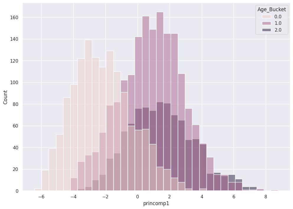
One Principal Component
SciKitLearn provides PCA.
from sklearn.decomposition import PCA
The following code collapses all seven features into one Principal Component.
pca = PCA(n_components=1)
pca.fit(normalizer(abalone_reg_df[metric_vars]))
pca_abalone_df = pd.DataFrame(pca.transform(normalizer(abalone_reg_df[metric_vars])),
                                     columns = ['princomp1'],
                                     index=abalone_reg_df.index)
SNS shows the utility of this Principal Component on the separability of the Classes.
sns.histplot( x = pca_abalone_df['princomp1'],
              hue = class_labels)
Two Principal Components
Now derive two principal components.
pca = PCA(n_components=2)
pca.fit(normalizer(abalone_reg_df[metric_vars]))
pca_train_features_df = pd.DataFrame(pca.transform(normalizer(abalone_reg_df[metric_vars])),
                                     columns = ['princomp1',
                                                'princomp2'],
                                     index=abalone_reg_df.index)
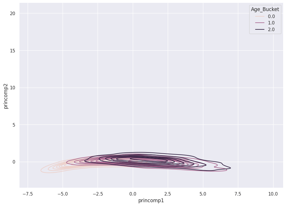
A KDE plot shows the three classes in relation to the two Principal Components.
sns.kdeplot( data = pca_train_features_df,
             x = pca_train_features_df['princomp1'],
             y = pca_train_features_df['princomp2'],
             hue = class_labels,
             fill = False)
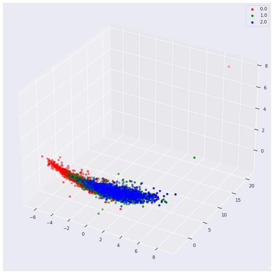
3 Principal Components
Astute readers anticipate the slight code modifications required to derive three Principal Components.
pca = PCA(n_components=3)
pca.fit(normalizer(abalone_reg_df[metric_vars]))
pca_train_features_df = pd.DataFrame(pca.transform(normalizer(abalone_reg_df[metric_vars])),
                                     columns = ['princomp1',
                                                'princomp2',
                                                'princomp3'],
                                     index=abalone_reg_df.index)
We use the 3d plot to see the separation of classes in relation to three Principal Components.
data_df = pca_train_features_df.assign(outcome=class_labels)
plot_3d(data_df,
        'outcome',
        'princomp1',
        'princomp2',
        'princomp3')
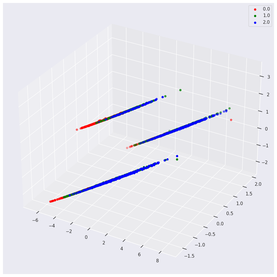
If you include one-hot encoded variables in your PCA, you may see weird results.
For example, we encoded the Categorical Sex feature into three Orthogonal numeric vectors, one for M, F and I. If you keep these vectors in the PCA you will see the following:
Conclusion
Bookmark this page for future reference. It provides a handy Cheat Sheet for useful Python Data Exploration and Data Viz tools.